
Using Motion to Enrich Your Case Studies
Just add motion: creating engaging case studies that tell a story with animated prototypes.
During our move to Squarespace, we had a thought: What if we also introduced some motion to the graphics in our case studies? It isn't like moving to a new CMS is that time consuming. There's always time to do more (said every designer ever)! Flawed logic and runaway timeline aside, it was certainly worth the effort.
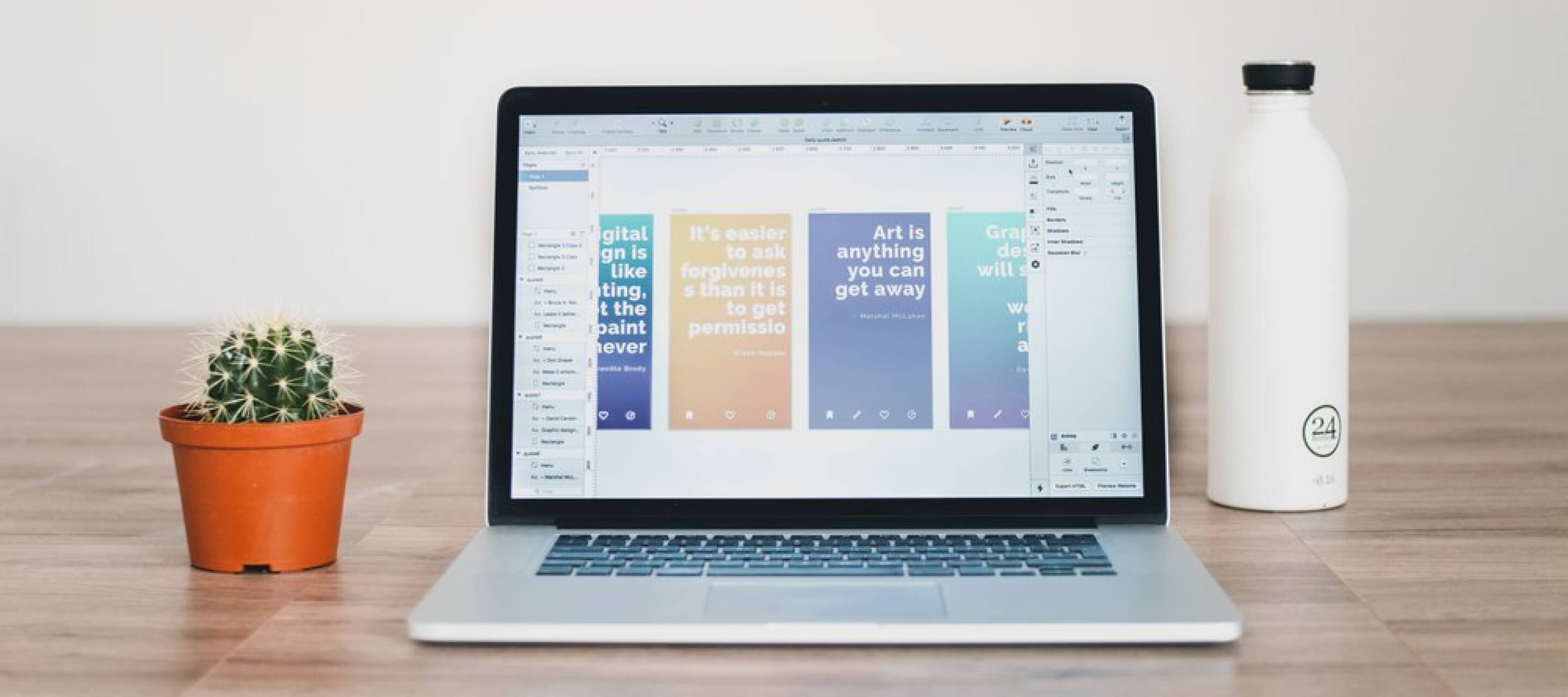
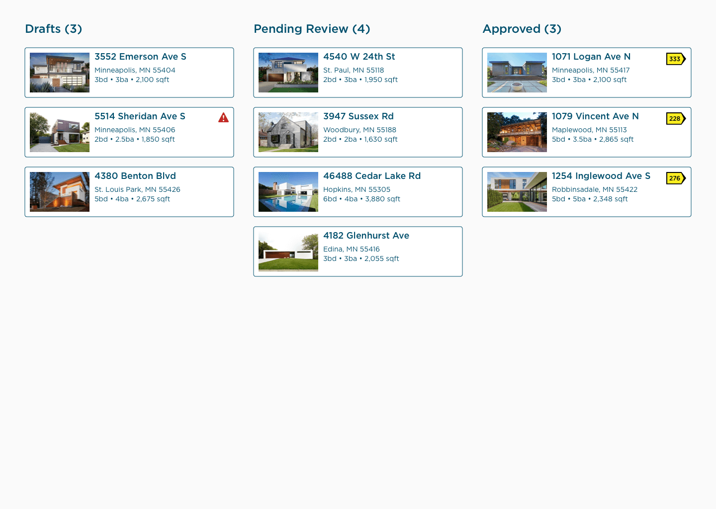
Micro-interactions and animation don't just delight, they tell a story. In their previous iteration, our case studies were a long scroll of screenshots and text. Pretty boring if you ask us, and worst of all, it only captured half of our design. Take a look at these two as an example from our Parade of Homes case study:
&
After: motion demonstrates the full breadth of functionality
To our surprise, creating quality motion graphics is trickier than one might expect, particularly if you care about website performance. To find that combination of efficient file size and high fidelity, we experimented with a lot of different tools before arriving at the process described below.
Record Your Design
Given our focus on micro-interactions and quality, we chose to create our recordings from design files. This means using a tool like Framer or Flinto for creating interactive, animated prototypes. Conveniently, these tools often come with built-in screen recording functionality, so there’s no need to fuss with perfectly framing a recording box around the area you want to record.
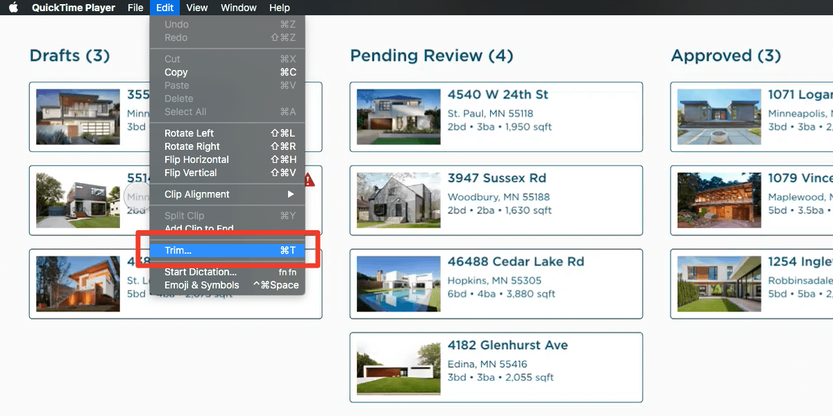
When deciding on an interaction flow, aim to keep your recordings under 10 seconds. That said, you can trim recordings in Framer or Flinto so don't worry too much about mouse movements at the beginning and end of the recording. If the motion tool you are using doesn’t have trim tools, you can also use QuickTime to clip extraneous footage.
Once everything is in place, hit "Record." Then select "Discard and record again." Do that over and over and over again. Even with a scripted path, there will be a lot of takes before a recording looks right. It's easy to go too fast or too slow or to forget what parts of the prototype are interactive or to instinctively press ⌘ cmd + ➡ tab when your boss walks by. Eventually, you will arrive at a clean recording without any misadventures. From there, export to the highest quality video format (usually MP4).
Upload Your Video
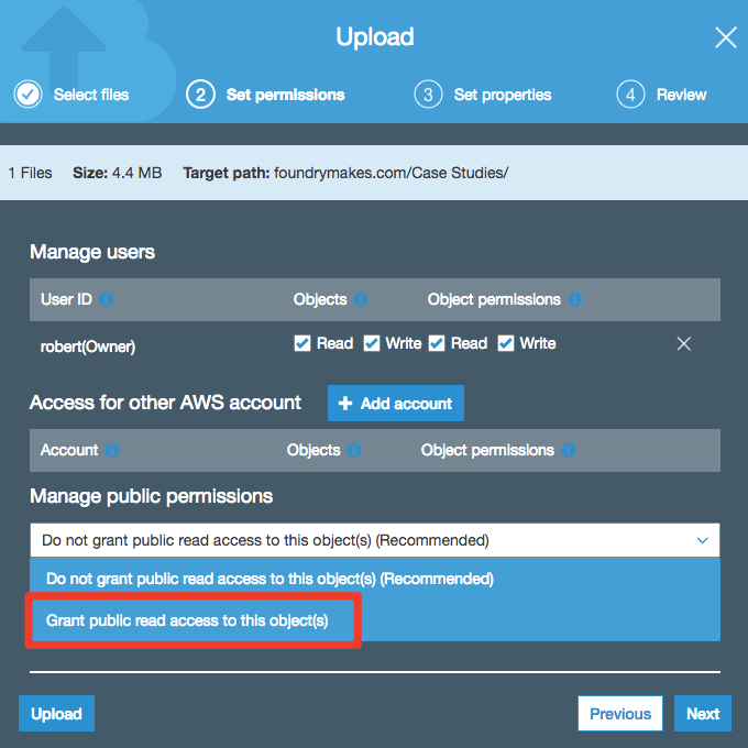
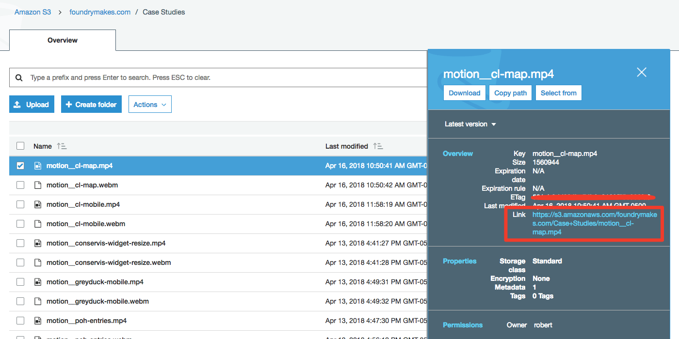
The next step is to get your video hosted. There are a lot of options here depending on a range of variables including what your current hosting situation is, the CMS you use, and your access to subscription products like Vimeo. For the sake of simplicity, we’re going to assume you are hosting the video yourself. For our money, an S3 bucket on AWS provides the best value and easiest configuration. Once you have a bucket, upload your video and set it to public.
After the upload is complete, select it from the file list to find the appropriate link. You will need this to embed the video file in your case study page.
Why not GIF?
GIFs are gigantic and take forever to load, especially on a phone. A looping video is higher quality at a fraction of the file size. The trick is configuring the <video> tag correctly so that it autoplays on the vast majority of devices.</video>
Embedding Your Video
Now that you have a well-scripted, perfectly-executed, internet-hosted video on your hands, it’s time to get that video into our case study so you can showcase it to the world. As mentioned, embedded video content will not automatically play in the browser unless you are careful about how that video is configured. Here’s the secret sauce:
<video autoplay muted loop playsinline=""></video>
<source src="case-study-video.webm" type="video/webm">
<source src="case-study-video.webm" type="video/mp4">
A video that is set to autoplay muted loop playsinline will automatically play on a loop in the vast majority of browsers. Safari is the real concern because of restrictions placed on autoplay videos in recent updates. It is really important the video is set to muted even if there is no audio, otherwise Safari will not play the video without user input.
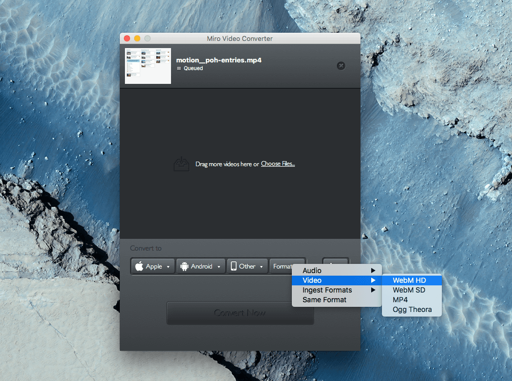
Another thing you may have noticed is that there is both MP4 and webM video formats. Quality tends to be even better at an even smaller file size when delivered as a webM. Firefox and Chrome even prefer webM. Unfortunately, Safari and Internet Explorer don’t know what to do with that format so you need both. Having tried a variety of options for converting MP4 files, including command line-based tools I finally discovered the dead simple Miro Video Converter built by the fine folks at the Participatory Culture Foundation. Just select your file and set your output to webM HD under the “Other” dropdown. It works wonderfully.
Framing Your Video
As always, the last step is to add a touch of style. Again, this will depend on a million different things and is ultimately a matter of personal preference. But, maybe you want to place one of your mobile videos into a nice device frame as we’ve done on the GreyDuck case study, among others. You could make the frame part of your design or add it during video processing, but that seems silly and the quality of the frame will suffer. Instead, you should use an SVG device frame and place the video with some CSS magic ✨. Let’s have a look at the raw code for our framed mobile videos.
.sqs-block-code {
.video-block {
margin-left: auto;
margin-right: auto;
text-align: center;
}
.mobile-video-block {
position: relative;
@media @for-phone-only {
width: 290px;
height: 580px;
}
@media @for-tablet-portrait-up {
width: 375px;
height: 750px;
}
@media @for-desktop-up {
width: 390px;
height: 780px;
}
video {
width: 92.5925926%;
padding-top: 17.7777778%;
}
}
.mobile-video-frame {
position: absolute;
top: 0;
left: 0;
height: 100%;
width: 100%;
background: url('/assets/images/phone-frame.svg');
background-position: 50% 50%;
background-repeat: no-repeat;
background-size: cover;
z-index: @z-overlay; // over everything, basically
}
}
}
That’s a fair amount of CSS but there are a few key parts. The video itself is set to relative and placed inside of a container called .mobile-video-frame that is positioned absolute. All of this is set inside of a .video-block container that is set to float in the center. Easy-peasy.
The real trick is these values on the video element itself: width: 92.5925926% and padding-top: 17.7777778%. These values ensure that the video will stick right in the middle of the mobile device frame no matter how the browser window is sized. Calculating these values is actually pretty easy. Let's take the device frame we use.
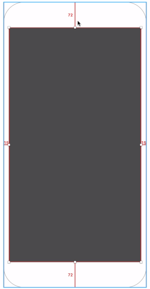
The dimensions of the frame are 405 x 810. The dimensions of the display area are 375 x 666. To find the relative width of the video, you just take 375 / 405 = 0.925925926. To find the relative padding-top you take (72 * 2) / 810 = 0.177777778.
Now you'll never need to worry about your frame looking blurry or your video wandering away. Happy showcasing.


ABOUT
Our clients do great things. We get to help.
